New Data Analysis Features on the Web App for your Partners
by Claudio

At c.techonolgy we believe that data and quantitative analysis can play the difference in creating a successful business. This is why we just finished implementing a data analysis tools for professionals. In this article, we will introduce you to the world of data analytics features and highlight what is possible when data is processed and turned into actionable information.
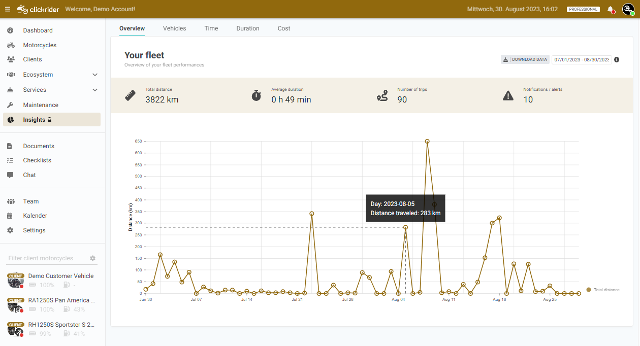
The data anlytics tools can be found in the menu on the left, clicking on "insight".
The first dashboard is this one 👇. Here you can check the amount of km/mileage travelled by our whole fleet. You can selected the analysis period by clicking the calendar, on the top right of the screen.
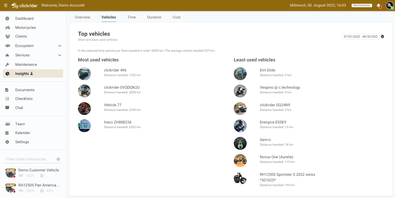
Pressing on the "vehicles" tab you can explore a vehicle by vehicle comparison. Is there any vehicles that are not being used frequently for some reason? Are there top vehicles and you should do maintenance on them often? This tab answers to these questions 👇
First, you can see which are the frequent and less used vehicles of your fleet based on the km traveled in the selected time period.
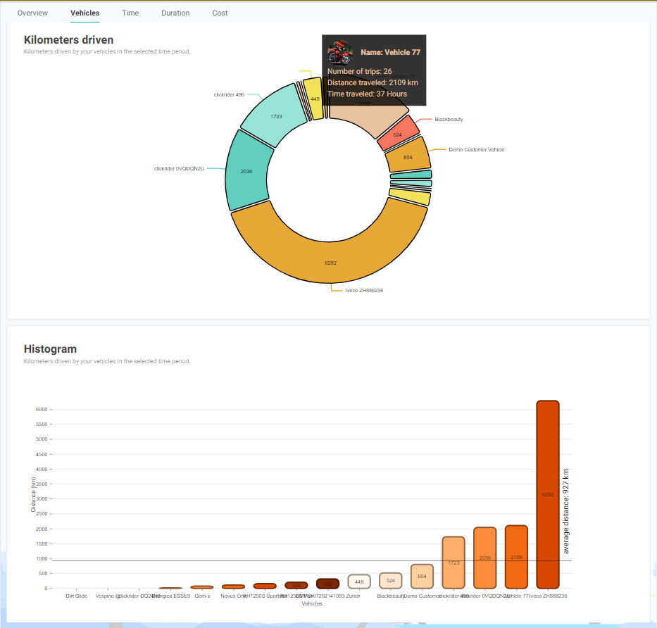
Then, you can see a pie and an histogram chart to visualize the km traveled by the different vehicles, in order to understand the performance of your fleet.
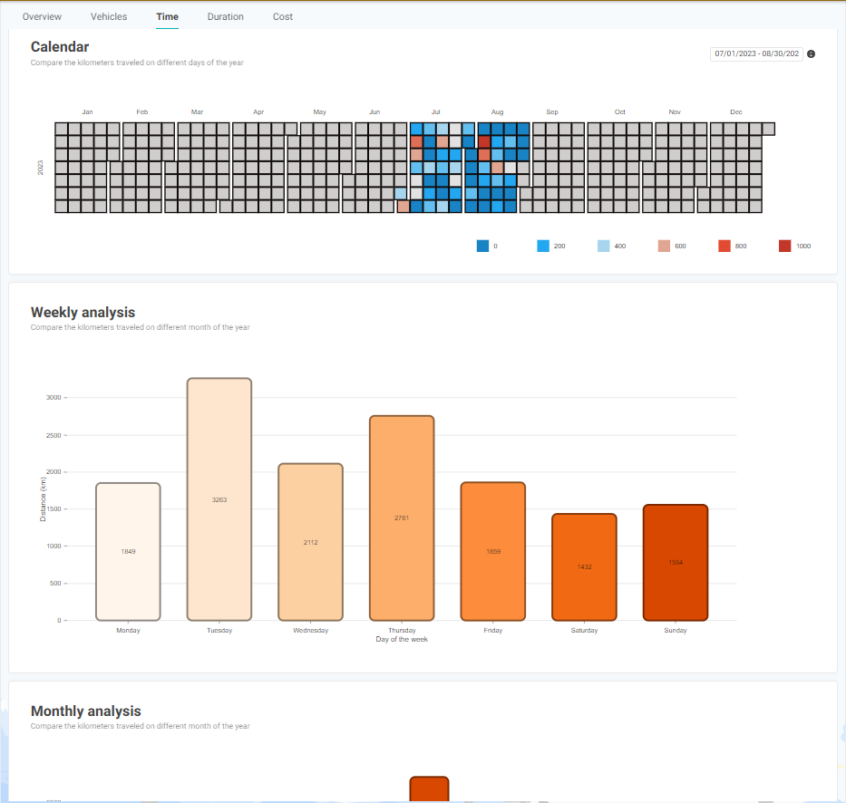
By pressing on the "time" button, you can explore the performance on the fleet over time. Are there important days of the week/month/year where you expect more customers? Are there top months? This tab answers to these questions 👇 The first chart is a calendar, where different colors indicate different km traveled, while the second and third chart is a visual representation of the km traveled in the different days of the week and month of the year, respectively.
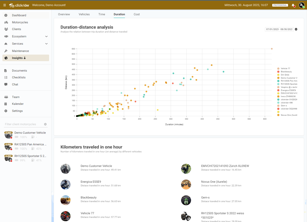
Finally, in the duration tab, you can explore the km travelled in one hour by the different vehicles. Are vehicles that travel more and consume more fuel? Should you consider increase the renting price for such vehicles? This tab answers to these questions 👇
The first scatter plot represent the distance vs duration of each trip by the various vehicles of your fleet. Different points indicate different trips, while different colors represent different vehicles.
In the info chards down, we can see on average how many km travelled each vehicle.
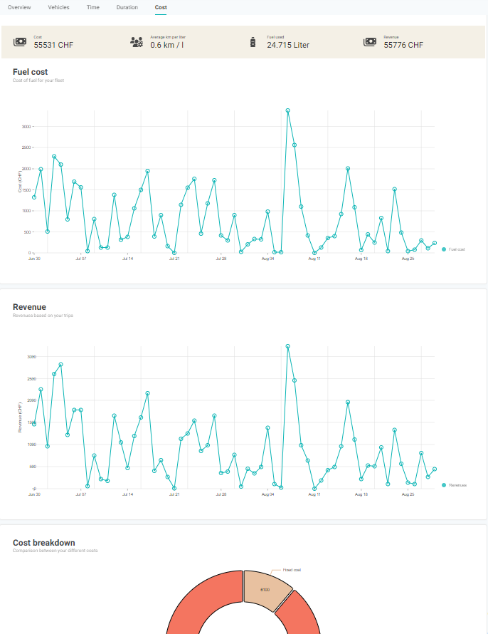
Finally, especially for rental / sharing operators, we now also offer a cost/benefit calculator, with a few clicks allows to easily understand how profitable the fleet is. The forecast of the expected turnover gives valuable information about the own business and allows early adaptations.
We hope you will like and benefit from the new features. Stay tuned, more will follow.
For any feedback please text to Claudio(claudio@ctechnology.io)